Smilo

All deliverables and artwork created at Red Antler
Overview
Smilo is a startup founded by two dads who had previously patented successful baby products for other well-known brands. We were tasked with launching their new private label, as well as their first ecommerce site. I was the lead UX designer on the project, working closely with the lead visual designer, brand designers, and lead strategist to create a meaningful experience.
Discovery
Working with startups, especially when they are investing quite a bit into branding, means a pretty lean discovery phase. I focused my initial efforts into learning as much as I can about the industry, competitors, and what makes Smilo unique. I also worked on designing a navigation that worked for their preliminary inventory size and product strategy.
Design
Knowing that in this particular use case customers tend to research products more heavily (aiming to find the very best products for their little ones), I wanted the site to be as helpful as possible from a content and functional perspective without being overwhelming. I also wanted the experience to offer a balanced dose of science/information and warmth.
Discovery
Sitemap
Smilo launched with a small inventory composed of two hero products and about a dozen secondary accessories/sets. We wanted to give users a direct route to our hero products for launch by highlighting them in the primary navigation instead of burying them under an umbrella category. Our long term plan was to revise the navigation once Smilo offers a larger assortment and outgrows this structure.


Objectives
Being cognizant of timeline and scope, I wanted to make the most of future client feedback rounds. To make sure we're in alignment before jumping into wires I shared high level objectives per template with the client, which sparked conversation around content and features.

Wireframes
Homepage
The homepage needed to check many boxes both functionally and emotionally. It had to establish a brand voice and personality, educate and sell users on Smilo's hero products, incorporate education and science without looking too clinical, build validity and value around this anonymous new brand, and most of all instill trust and engage new parents.
One way to create a balance between education and emotion was incorporating lifestyle imagery of the product in use as we're explaining the science behind it. Seeing a baby engage with the product is obviously more impactful than straight product shots.

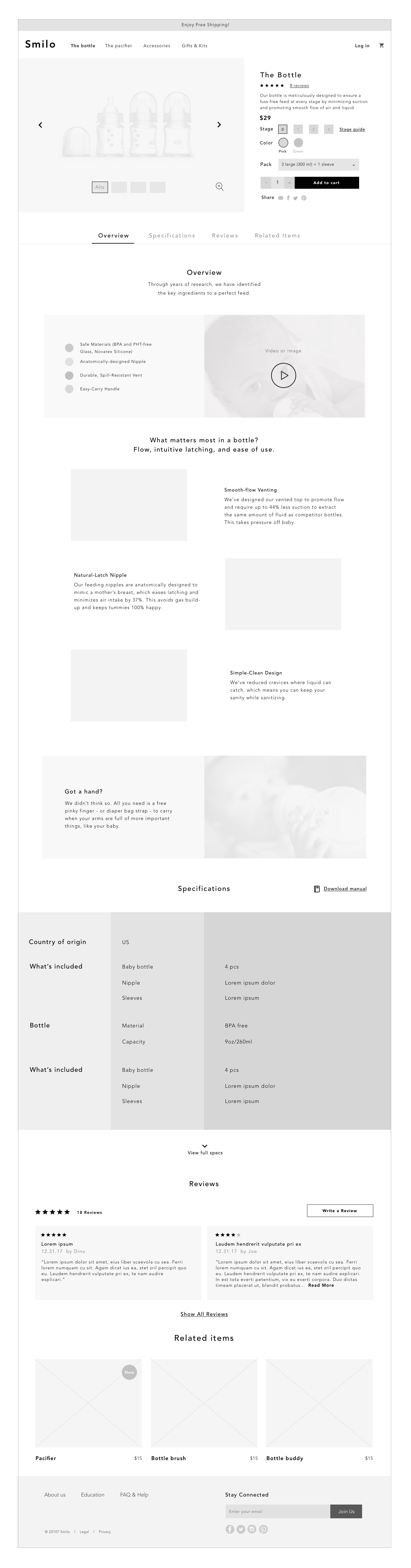
PDP
Complex products like bottles and pacifiers require users to make various selections (stage, color, pack type). I wanted attributes to be easily selectable and for the details area to remain clean and simple. A secondary navigation (Overview, Specs, etc.) follows users down the page so they can skip sections or anchor back to the top. Animated GIFs are incorporated to help explain the thoughtful design and features.
The template was also designed with simpler products in mind. A simplified version of this template with certain modules "turned off" was shown to the client to demonstrate how they would be able to use it for accessories as well.
Checkout
I wanted checkout to be quick and painless both to returning users and new users. Incorporating log in into the one page checkout eliminated a preliminary screen for all unauthenticated users, and weaving account creation into the process at a point where sign up benefits are obvious encourages new users to create an account.
Unauthenticated user

Logged in user
