Anheuser Busch - Magento Imagine 2017 Excellence Awards Winner
All deliverables created at Born Group
Overview
For this Anheuser Busch US launch I was tasked with translating existing B2B app functionality into a responsive site. Unlike the app, the client wanted this experience to feel more like a B2C site and looked to us for guidance. This was an Agile project with a very tight timeline. It leveraged both Magento and existing APIs for our content and served as a model site for 40 other countries.
Discovery
During the short Discovery phase I studied the wireframes used for the original app as well as the actual app. I started thinking of ways to translate this very task oriented app experience into a more rich web experience. I researched various Anheuser Busch websites to look for content ideas and get a grasp of their brand selection, and inventory types.
Design
Knowing that Anheuser Busch will not be producing any major content pieces for launch, and that a lot of the content will need to come in from existing APIs, I had to think outside the box when it came to content strategy. I leveraged available app content and product info and introduced curation, large branded imagery, and product spotlights into the mix.
Wireframes
Homepage
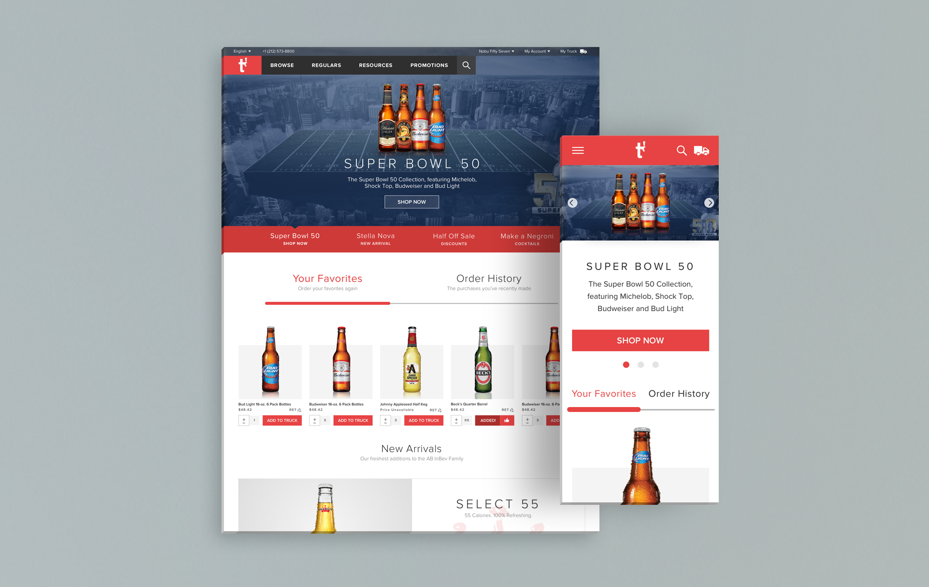
The Homepage prominently features recently ordered items with modified quantities based on the user's original order. Users can quickly add these items to their truck or repeat entire orders from the Order History tab.
Below is a New Arrivals product spotlight, introducing newness to users in a more engaging way than a dry list of items would.
The Seasonal Favorites module was introduced to accommodate product lists relevant for the time of year, holiday, sporting event etc. which adds a nice and low maintenance element of curation.
Onboarding
Upon landing users are asked to log in in order to gain access to the site. I wanted to make it very easy for returning users to sign in but also provide new users with all of the information they need.
On desktop we have a parallax affect as users scroll and the onboarding slides change. The bottom arrows are animated to gently prompt users to continue scrolling and at the final slide to create an account.
On mobile, tapping on the Learn How button at the top will anchor users down the page elegantly to the "How does it work" simplified mobile version.
Brand Family Landing Page
The app experience for all landing pages was pretty bare, featuring text lists of sub-brands. I wanted to feature our beautiful branded imagery to add some life to these pages, as well as an Expert's Pick product spotlight that can give exposure to more popular or obscure items.
Product Ordering Page
One of my goals for the project was to find efficiencies wherever possible to simplify the user's experience. I often combined several screens in the app into one on the site (including this template) to eliminates an extra click and keep all relevant info in one place.
My Truck (My Cart)
Users can easily switch between accounts (stores) at any time. Sticky functionality both on desktop and mobile keeps the Submit Order button easily accessible for larger and longer orders.
Live Onboarding Demo Video
Final Designs
Visual designs were created by Joseph Paquette.
HOMEPAGE
BRAND FAMILY
PRODUCT ORDERING
MY ACCOUNT
MY TRUCK


